A 30-Minute Accessibility Audit Any Frontend Developer Can Run

Most teams I talk to agree accessibility matters, and most of them also admit they don't check it until someone complains or a procurement form asks for a compliance statement. The usual reason is that it sounds like a specialist job: a long audit, an expensive consultant, a report nobody reads.
A full audit is a specialist job. But a first pass isn't. With a keyboard, a screen reader that's already on your machine, browser zoom and one browser extension, any frontend developer can find the most common and most serious problems on a page in about half an hour. This post is that half hour, step by step, with the WCAG 2.2 success criteria each check relates to so you can file issues properly.
One honest caveat before starting: this won't make a site "WCAG compliant". It will catch the issues that block real people most often, and it will build the habit that makes a later full audit much cheaper.
Before you start: pick your pages
Don't audit the whole site. Pick three pages that represent most of your templates and your most important flow. For a typical Laravel or WordPress project that's the homepage, one content or listing page, and the form that makes you money (signup, checkout, contact). Open a plain text file for notes. For each issue, write the page, the element, what happened and the WCAG criterion if you know it.
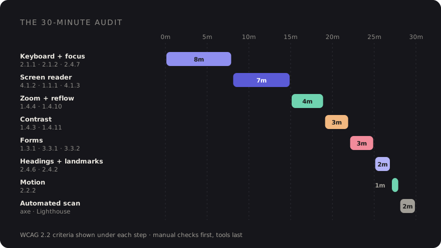
1. Keyboard-only pass (8 minutes)
Put your mouse out of reach. Seriously, move it. Then use only Tab, Shift+Tab,
Enter, Space, the arrow keys and Esc. On macOS, Safari needs "Press Tab to
highlight each item on a webpage" enabled in its settings, and Firefox follows the system keyboard
navigation setting, so Chrome is the easiest place to start.
Work through the page from the top and ask:
- Can I reach everything interactive? Menus, dropdowns, accordions, carousels, the cookie
banner, the "load more" button. Anything built from a
<div>with a click handler is a prime suspect. (2.1.1 Keyboard) - Can I get out again? Open every modal and widget and make sure
EscorTablets you leave. Getting stuck in an embedded map or video player is common. (2.1.2 No Keyboard Trap) - Does the order make sense? Focus should follow the visual reading order. Jumps caused by
CSS reordering or positive
tabindexvalues are confusing. (2.4.3 Focus Order) - Is there a skip link? The first
Tabon a page with a big header should offer "Skip to content". (2.4.1 Bypass Blocks)
Modals deserve extra attention: focus should move into the dialog when it opens, stay inside while it's open, and return to the button that opened it when it closes. I wrote up the pattern in detail in accessible modals with the native dialog element and Alpine.
2. Focus visibility (part of the keyboard pass)
While you're tabbing, watch the focus indicator. Every focused element needs a clearly visible one.
The two classic failures are outline: none in a reset with nothing replacing it, and a focus
style so subtle (a 1px colour shift) that you lose track of where you are. (2.4.7 Focus Visible)
WCAG 2.2 added a related check: the focused element shouldn't be completely hidden behind something you put on top of the page, such as a sticky header, a cookie banner or a chat bubble. Tab down a long page and watch for focus disappearing under the header. (2.4.11 Focus Not Obscured (Minimum))
In Tailwind projects the fix is usually a consistent focus-visible: style on your base
components:
<a href="/pricing"
   class="rounded-md focus-visible:outline-2 focus-visible:outline-offset-2 focus-visible:outline-indigo-600">
    Pricing
</a>
For the sticky header problem, scroll-padding-top on the html element, set to the
header's height, keeps focused elements and anchor targets from landing underneath it.
3. Screen reader spot check (7 minutes)
You don't need to be fluent in a screen reader to learn a lot from five minutes with one. Use what you have:
- macOS: VoiceOver. Toggle it with
Cmd+F5. The VoiceOver modifier isControl+Option. Press modifier+Uto open the rotor, then use the arrow keys to browse lists of headings, links, landmarks and form controls. Safari is the best-supported pairing. - Windows: NVDA. Free to download. In browse mode,
Hjumps between headings,Dbetween landmarks,Fbetween form fields andBbetween buttons.Insert+F7opens a list of elements.Ctrlstops speech when it gets chatty.
Spend your minutes on three questions. Do icon-only buttons have a name, or does the screen reader just say "button"? Do images convey the right thing, with decorative ones skipped and meaningful ones described? And when something changes without a page load (a toast, an "added to cart" message, a Livewire validation error), is it announced at all? (4.1.2 Name, Role, Value; 1.1.1 Non-text Content; 4.1.3 Status Messages)
The fix for a nameless icon button is usually one attribute:
<button type="button" aria-label="Close" @click="open = false">
    <svg aria-hidden="true" …>…</svg>
</button>
4. Zoom to 200% and check reflow (4 minutes)
Zoom the browser to 200% with Ctrl or Cmd and +. All content and functionality
should still be there: no clipped text, no overlapping elements, no buttons pushed off screen. (1.4.4
Resize Text)
Then test reflow. The criterion is that content works at a width of 320 CSS pixels without scrolling in two directions. The quick way is to set a 1280px-wide window to 400% zoom, or use the device toolbar in DevTools at 320px wide. Look for horizontal scrollbars, fixed-width tables and sticky elements that eat the whole screen. (1.4.10 Reflow)
Data tables and code blocks are allowed to scroll horizontally inside their own container. The page as a whole shouldn't.
5. Colour contrast (3 minutes)
The thresholds to remember: 4.5:1 for normal text, 3:1 for large text (roughly 24px regular or 18.66px bold and up), and 3:1 for the visual parts of UI components and meaningful graphics, like input borders, focus rings and icons that carry meaning. (1.4.3 Contrast (Minimum); 1.4.11 Non-text Contrast)
Chrome's colour picker in the Styles pane shows the contrast ratio for text, and the axe extension (step 9) flags text contrast automatically. The ones tools miss most often are text over images or gradients, placeholder text used as a label, and light grey input borders on white. Check those by eye.
6. Forms and labels (3 minutes)
Go to your money form and check:
- Every field has a visible label that's programmatically associated with it, via
<label for>or wrapping. Clicking the label should focus the field. (1.3.1 Info and Relationships; 3.3.2 Labels or Instructions) - Placeholder text isn't doing the label's job.
- Submit the form empty. Errors should be described in text, not just a red border, and tied to the field. (3.3.1 Error Identification)
- Personal fields use the right
autocompletevalues (email,name,street-address) so browsers and assistive tech can fill them. (1.3.5 Identify Input Purpose)
<label for="email">Email</label>
<input id="email" name="email" type="email" autocomplete="email"
       aria-describedby="email-error" @error('email') aria-invalid="true" @enderror>
@error('email')
    <p id="email-error">{{ $message }}</p>
@enderror
7. Headings and landmarks (2 minutes)
Use the VoiceOver rotor or NVDA's elements list from step 3 to view the heading outline. You want one
clear h1, and headings that describe their sections without skipping levels just for
visual size. Then check landmarks: header, nav, main and
footer should exist, with exactly one main. While you're there, check the page
has a meaningful <title> and a lang attribute on <html>.
(1.3.1 Info and Relationships; 2.4.6 Headings and Labels; 2.4.2 Page Titled; 3.1.1 Language of Page)
8. Motion (1 minute)
Anything that moves, blinks or scrolls automatically for more than five seconds needs a way to pause it. Auto-playing carousels and background videos are the usual offenders. (2.2.2 Pause, Stop, Hide)
Then turn on reduced motion. In Chrome DevTools, the Rendering panel can emulate
prefers-reduced-motion: reduce. Parallax, big slide-in animations and page transitions should
calm down. Tailwind's motion-safe: and motion-reduce: variants make this easy to
get right.
9. Automated scan, and its limits (2 minutes)
Last, run a tool. The axe DevTools browser extension and the Accessibility category in Lighthouse (which uses the axe-core engine under the hood) are both free. They're very good at what they check: missing alt attributes, missing form labels, many contrast failures, invalid ARIA, duplicate IDs in ARIA references.
I run them last on purpose. Automated tools can only check what's detectable from the markup, and a large share of WCAG needs human judgement. A tool can tell you an image has alt text. It can't tell you the alt text says "image123.jpg". It can't tell you focus order is confusing, that a modal traps you, or that an error message is useless. A perfect Lighthouse score with a broken keyboard experience is common. If you only have two minutes, the keyboard pass finds more real problems than the scan.
What to do with your notes
Sort what you found into three buckets:
- Blockers: someone can't complete a task. Keyboard traps, unreachable controls, unlabelled form fields, a checkout button a screen reader can't name. Fix these first.
- Pattern fixes: one component causes the issue everywhere. A missing focus style in your button component, an icon button without a label. Fix it once in the shared Blade component and it's fixed on every page.
- One-offs: a single low-contrast banner, a skipped heading level. Batch them.
The 30-minute checklist
- Keyboard: everything reachable, nothing traps, order makes sense, skip link works.
- Focus: always visible, never hidden under sticky UI.
- Screen reader: buttons and images named, dynamic updates announced.
- Zoom: 200% works, 320px reflows without sideways scrolling.
- Contrast: 4.5:1 text, 3:1 large text and UI parts.
- Forms: real labels, text errors tied to fields, correct
autocomplete. - Structure: sensible headings, landmarks, page title,
lang. - Motion: pausable, and respects reduced motion.
- Automated scan: clean, but never treated as proof.
Put it on a calendar. Half an hour per major release, done by whoever built the feature, catches far more than an annual audit ever will. And once the blockers stop showing up, you'll know the habit is working.
Discussion